Atlanta Homes – Tour of Kitchens Review
What is it?
Every year Atlanta Homes and Lifestyles magazines sponsors a tour where viewers get the opportunity to see 12 different kitchens designed by 12 different designers. The event is broken up into two days so 6 kitchens on Saturday and 6 kitchens on Sunday.
This weekend, a couple friends and I attended the Saturday showing.
These homes are a mixture of designers personal homes and homes of their clients.
Tour of Atlanta?
Another fun thing about the Tour of Kitchens is that these homes are not in the same neighborhood. They are spread out all over Atlanta so you get the opportunity to see different neighborhoods and landscaping throughout the city.
Pro tip: Look up the addresses first and make a plan so you’re making the most of your day. There was a starting point (a design showroom) and we started with the furthest home and worked our way back. We got lunch after the 3rd house.
Let’s get started! (In order from how I visited them)
House #1
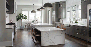
This was the first kitchen we saw on the tour and it was fine. I honestly felt a bit underwhelmed by this kitchen. Yes, it is a beautiful kitchen and the color is pretty. I thought that the island was too big and I didn’t like the floating shelves above the range. The drop down feature in the island is cool but it just felt like you’d get a workout in every time you cook in this kitchen.
They chose a white subway tile as the backsplash and subway is classic but a little boring. I also wish they would have brought in a cool light fixture either above the breakfast table or island to mix it up- using the same fixture was a bit redundant.
House #2
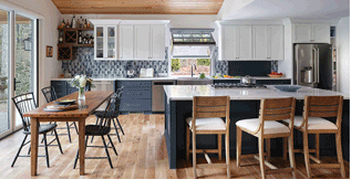
Courtesy of Atlanta Homes Mag
I thought this home was very charming, this was a suburban colonial style brick home. They used a navy blue on the base cabinets including the island. They did the island in a beautiful Cambria quartz countertop and used a MSI quartz on the perimeter cabinet which is a great way to utilize your resources. Cambria is a high end line and MSI is definitely more affordable.
I loved the personality of this kitchen, the window folds up, there is a fun blue backsplash tile that ties in with the base cabinets, and a wet bar on the far left of the kitchen that brings in a warm wood tone.
House #3
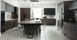
This kitchen was very modern and minimalistic. I liked the dark stain on the cabinetry and that they mixed in different countertop colors, including a Dekton backsplash. The layout of these kitchen is pretty efficient- the range is on the left wall, the fridge is on the back left corner and the sink is in the back left corner of the island which creates a great working zone. There is also a TON of countertop space in this kitchen.
There are two things I didn’t love about this home. 1) There was very little symmetry in this kitchen and in the design world symmetry is key and feels right. 2) This is not a critique on the kitchen itself but a grievance of the home- I hate when you see an ultra modern home in the middle of a traditional/transitional neighborhood, it just does not fit!
House #4
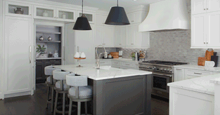
Kitchen number four included shaker white cabinets and a grey painted island. The refrigerator and freezer are to the left of the island and disguised in panels that match the cabinetry doors (panel ready appliances). Between the fridge and freezer is a wet bar and pantry.
This kitchen has a great layout but all in all it was well, boring! Shaker white cabinets are a classic look but when I go on a tour of kitchens I am expecting to see things I haven’t seen before. The countertops are a white quartz with grey veining and I think it would have been nice to use a different top on the perimeter white cabinets to create some color dimension.
House #5
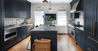
Courtesy of Atlanta Homes Mag
This navy blue kitchen was described by the designer as “small yet mighty” and I could not agree more. They did a great job of creating symmetry and I love all blue kitchen with gold accents. People always think that using a darker color will make a space feel dark and this kitchen was not dark at all.
The countertop was a quartzite which is very popular right now, quartzite is stronger than granite but has the beauty, color depth, and price tag of a marble slab.
I loved the use of color on the cabinetry, brass hardware and the functionality of the kitchen layout.
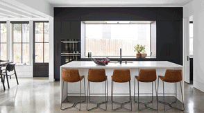
Courtesy of Atlanta Homes Mag
Last of day was this minimal kitchen nestled inside of Virginia Highlands and again, another home that did not fit the neighborhood but I digress.
I am not a huge fan of minimalism so this kitchen did not do much for me. The kitchen and the home itself felt more like a museum than a home. I thought it was interesting that they chose not to put a lighting fixture above the island.
Overall thoughts?
While not every home was my taste I did appreciate the fact that there was a mixture of different styles and color tones in each home.
My favorite kitchens were the ones that felt lived in and brought in color, especially house #5 because it was well thought out, homey, and had some personality.
Notable Materials Used:
-Dekton Countertops
-Cambria Countertops
-Top Knobs Cabinet Hardware
-Waterworks Plumbing
-Wolf Appliances
If you live in the Atlanta area I highly recommend checking out Atlanta Homes and Lifestyles Tour of Kitchens. Go with a friend or alone, trust me you’ll have a blast and you’ll leave with so many ideas and inspiration.
Thank me later.